Turn Polarity into Persuasion
🧠 Learn why negative framing boosts ad engagement, and create pro infographics with Figma Make.

Hey there 🧠
Ready for another day of staying ahead of the competition in the Growth race?
Oh and before we go ahead! If your friend sent this to you, be sure to subscribe here! So you don’t miss out on any editions.
Partnership with Stack Influence
How Lenny & Larry’s 11X’d Amazon Sales Without Spending More on Ads

Ever launched a new product that just wouldn’t move, no matter how much you spent on ads? That was Lenny & Larry’s when their Protein Pretzels hit Amazon. Sales flatlined, rankings tanked, and every PPC tweak failed to lift the curve.
Then they flipped the playbook. Instead of paying for impressions, they turned 1,560 real customers into micro-influencers.
Each one bought the product, shared real content, and posted authentic UGC. The results speak for themselves:
- Sales surged from 1K to 11K units/month, driven entirely by organic demand.
- Over 500+ authentic reviews poured in, building instant trust and visibility.
- The campaign generated $2M+ in new revenue, all without increasing ad spend.
That’s the power of Stack Influence. You can turn real customers into content creators and pay them only with your products, no ad budget required.
💡 Why Negative Framing Can Make Your Ads More Effective
When creating marketing campaigns, most people naturally choose positive phrasing. Yet research shows that using negative framing can make your message sound more confident, focused, and persuasive. Instead of only saying who your product is for, highlighting who it is not for helps your audience identify more strongly with your brand.
Consider two taglines for a new yoga class:
- “Not for those who like a groggy start to the day.”
- “For those who like an energetic start to the day.”
Studies show the first tagline performs better. Negative framing works because it is clear, bold, and self-selective.
1️⃣ The Recommendation: Use negative framing in ads, product descriptions, and social captions. Statements such as “If you don’t like rock-hard beds, this mattress isn’t for you” clearly define your audience and attract those who resonate with your message. This strategy is especially powerful for products tied to personal preference, like coffee, skincare, or fitness gear.
2️⃣ The Findings: A series of eight experiments with more than 2,000 participants found consistent results:
- Coffee lovers were 48.4 percent more likely to choose a dark roast when framed as “Not for you if you don’t like dark roast.”
- Hot sauce fans showed 11.1 percent higher purchase intent when told, “If you don’t like your wings with a kick, this is not for you.”
- A toothbrush ad framed negatively led to 30 percent more clicks and engagement.
3️⃣ Why It Works: When a brand confidently states who its product is not for, it signals specialization and authenticity. Customers view it as higher quality and better suited to their needs because it feels more focused and intentional.
4️⃣ A Real-World Example: BOOM! Beauty celebrates aging but rarely defines who their products are not for. Reframing their message as “Not for women trying to hide their age” could make their appeal stronger and more relatable.

The Takeaway
Negative framing draws attention, builds trust, and strengthens identity. It helps customers feel seen, not sold to, and positions your brand as confident in who it serves.
💡 How to Make Pro Infographics with Figma Make
Creating infographics no longer requires hours of design work. With Figma Make, you can generate high-quality, brand-ready visuals in just a few minutes using simple text prompts.

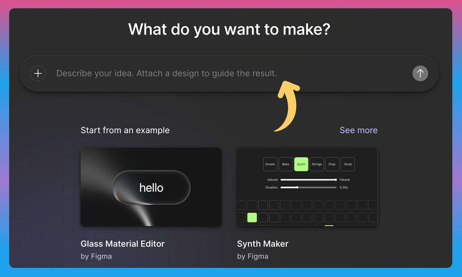
1️⃣ Get Started: Log in to Figma, open Make, or go directly to the Figma Make page. Upload a reference infographic or any visual that matches your style. Then, type your prompt describing the infographic you want to create.
2️⃣ Write a Strong Prompt: For example: “Turn the article below into a single-page, info-dense infographic for LinkedIn (1080×1350). Use my brand palette [#HEX1, #HEX2, #HEX3]. Create a clear hierarchy (H1 title, 3–5 section headers, concise bullets), simple icons, and a clean grid. Highlight key stats as callouts, include a minimal footer CTA [enter CTA], and keep body text under 14 words per bullet.”
Paste your article or content below the prompt and hit Enter. Within seconds, Figma Make will generate your first draft.
3️⃣ Refine and Customize: Use quick prompts such as “tighten bullets,” “larger callouts,” or “simplify layout” to polish your infographic. You can also switch to the code editor for precise adjustments.
4️⃣ Publish and Import to Figma: Once satisfied, click Publish and copy the public URL. Open the HTML to Design plugin in Figma, paste the link, and import the design. This lets you make final edits to colors, icons, and spacing directly inside Figma.
5️⃣ Export Your Final Design: After refining the layout and applying your finishing touches, export the infographic as a PDF or high-resolution image ready for social media, presentations, or reports.
The Takeaway
Figma Make combines automation with creative control, turning long-form content into visually engaging infographics that fit your brand. With the right prompt and a few refinements, you can transform text into professional designs in minutes instead of hours.
As we prepare more "Growthful" content, we'd love to hear your thoughts on today's edition! Feel free to share this with someone who would appreciate it. 🥰